Develop
🔍 Potential solutions for 'How can personal interactions with energy be made more visible and tangible?'
Concept 1: Interactive visual display for kids that links learnings in school to the home family life.
Educate younger individuals on the environmental impacts energy consumption has, through providing guidance and tangible tasks in the home everyday life to save energy.
Concept 2: Interactive interfaces to balance household dwellers energy budget.
Collaborate with other household dwellers to work towards a common goal. The big interface stays stationary to the home, whilst the digital watch interface allows freedom to monitor, communicate and control energy consumption 'on the go'.
Concept 3: Upgrade your home! To be more eco-efficient and economical appliances.
Using photo recognition AI software (example Google Lens) to capture appliances around your home, it can identify appliances and if whether it is in need of an upgrade. Upgrading appliances can help save energy as they are becoming more efficient.
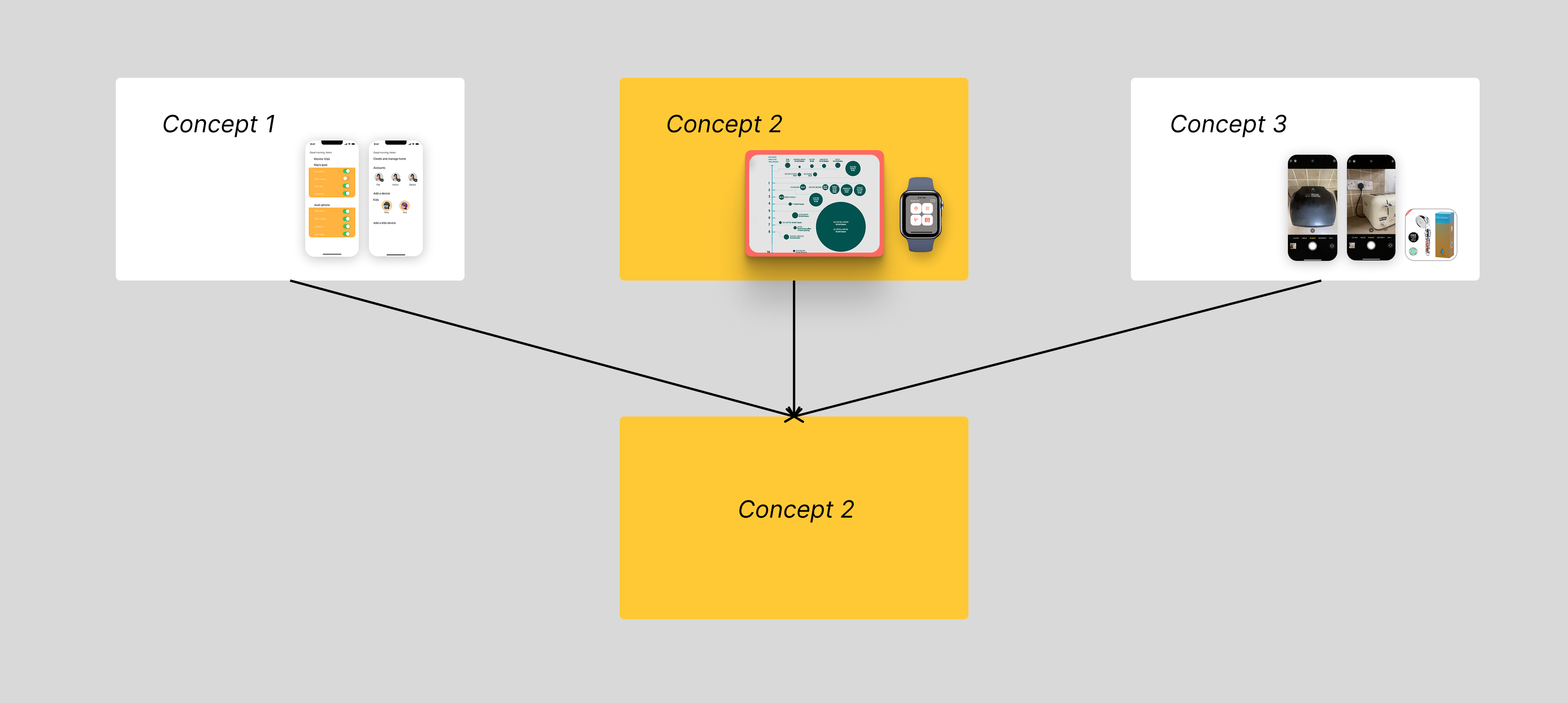
Why Concept 2?
- The most appropriate concept to meet the brief, user needs and wants.
Key themes:
- Energy saving
- Real time information
- Inclusive design for all
"How will this improve their experience? Will it save them time? Will it save them money? Will it provide them with a better service?" - Ita Langton, head of technology and transformation at Deloitte Ireland.
Expected outcomes or opportunities:
- Create a stress free user experience with (heuristically tested) User Interface (UI) designs for the interface.
- 'On the go' application design for digital watch devices, to save users more time in their busy routines.
- Energy management application to help users save money on their energy bills.
- A tangible way to visualise energy consumption through User Interface (UI) design.
- Community, interactive feature to help encourage saving energy altogether in households.
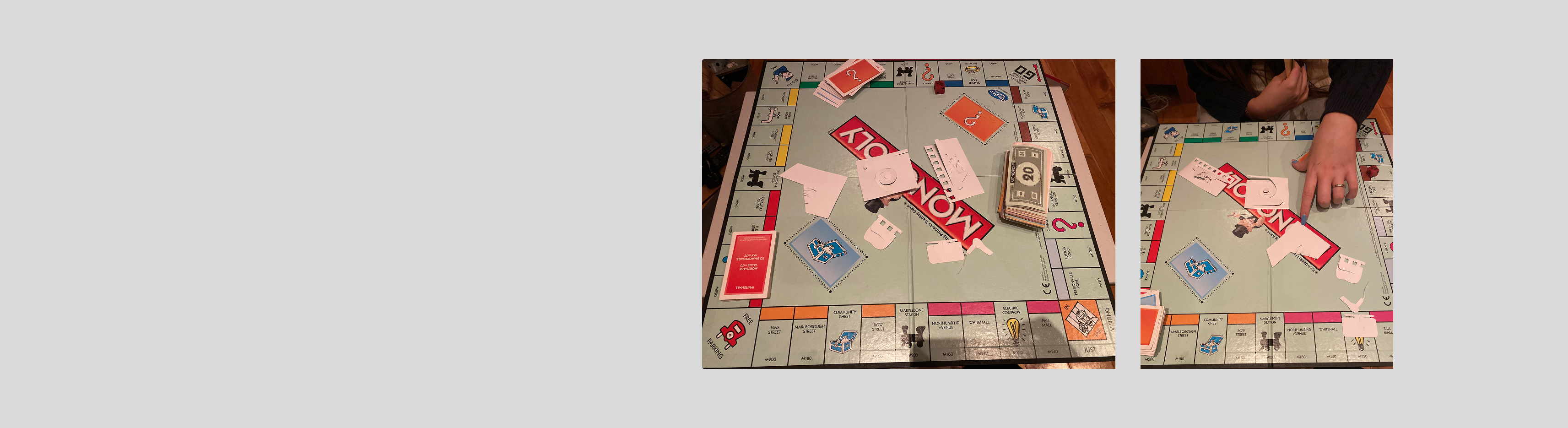
#1 Experience Prototyping Testing (cash delegation test)
Before beginning any low or high fidelity prototypes. I am testing the concept in a tangible, physical way to get an idea for how the application will operate.
This method helps identify user behaviours and how they prioritise spending when energy costs exceed their budget.
The set up
This test stimulates a real-life scenario. Users are given a set amount of cash (the budget) which they must distribute across different household appliances. The second round, a certain amount of cash is taken away, and again they must prioritise their spending on certain household appliance.
Participant quotes:
🗣 “It’s really hard to decide which appliances to cut back on. I need more guidance on what uses the most energy.”🔍 Insight: Users might benefit from recommendations or usage breakdowns in the app to help them make informed decisions.
🗣 “I was doing fine until the second round when my budget was cut—it felt stressful trying to figure out what to prioritise.”🔍 Insight: Users experience stress and uncertainty when faced with sudden budget changes. The app could provide early warnings or adaptive budgeting tools to ease this transition.
🗣 “I’d rather get a warning before I overspend rather than a message after it’s too late.”🔍 Insight: Preemptive nudges (e.g., “You’re on track to exceed your budget in 3 days”) might be more effective than reactive alerts.
🗣 “If I knew I could ‘earn back’ some budget by using less energy earlier, I’d plan my usage better.”🔍 Insight: Introducing energy-saving incentives (e.g., roll-over savings or bonuses for staying under budget) might improve long-term engagement.
🗣 “It would be motivating if I could see how my savings compare to last month.”🔍 Insight: A historical comparison feature could help users track progress and feel rewarded for energy-efficient behaviour.
Moving forward...
Emotional reactions: Need for stress reducing features like forecasting, alerts and transparency.
Behavioural insights: Guide design choices for notifications, gamification and spending adjustments.
Pain points: The necessity of budgeting and prioritisation tools.
.png)
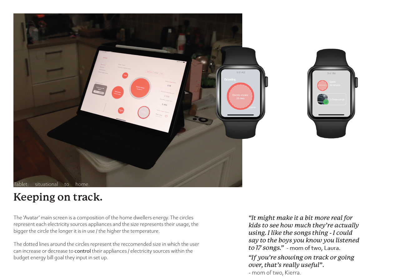
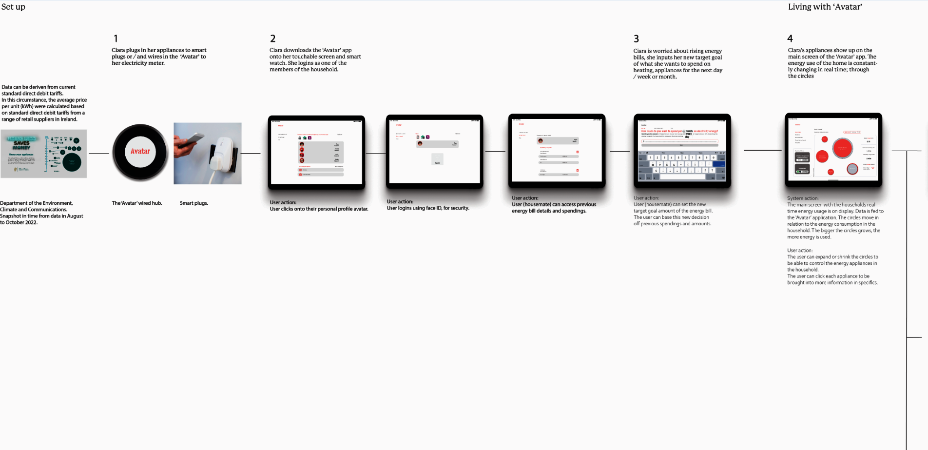
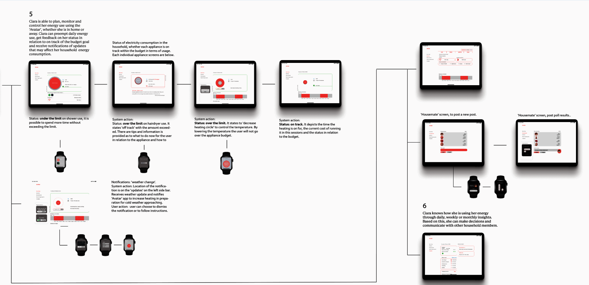
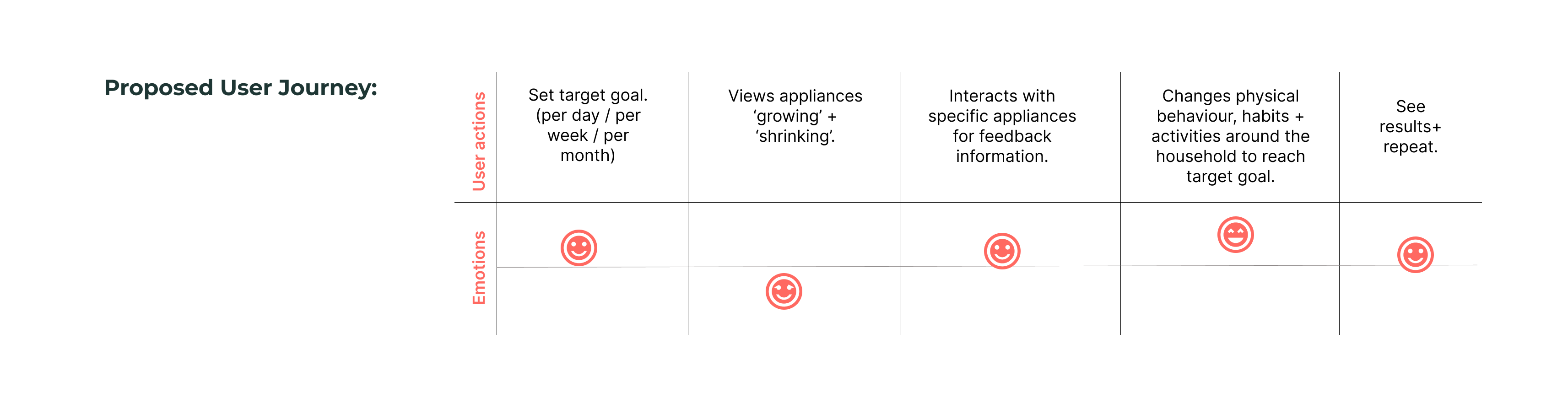
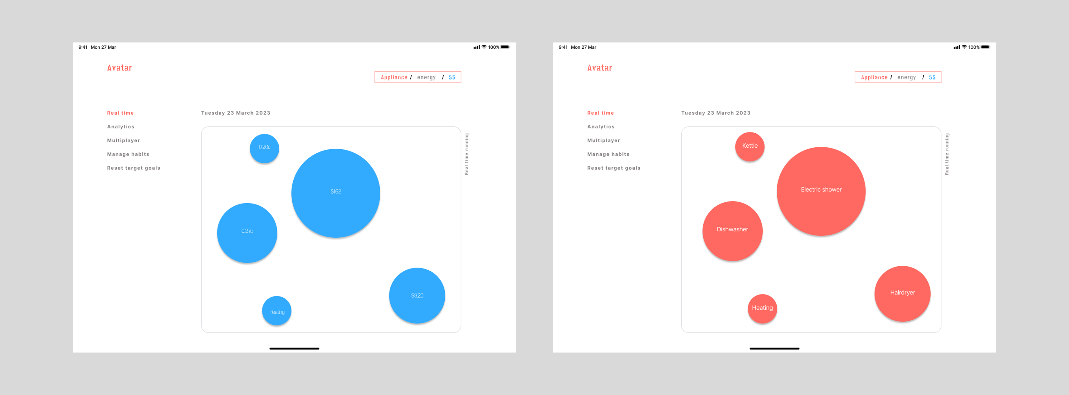
Application user flow: Set target energy spending goal (day / month / year), view appliances in real time on the interactive screen (the circles represent appliances and they grow and expand or shrink depending on their usage). The user can interact with a selected appliance (circle on the screen) and receive feedback on its status. The user can then adapt to the feedback through guided changed behaviour, creating more economical and better habits. This is reinforced with a report for the user to view results and repeat.
#2 User scenarios for usability testing
.png)
Interaction + UI design of product (app):
Alerts "off track" + black line in circle represents the budget of the particular appliance, the circle has gone over the black line.
"Could it notify when im nearing my budget limit?"
"This is helpful, but can it suggest what I should do next?”"
Insights:
Customisable alerts.
They want next steps, i.e. "try unplugging appliances overnight"
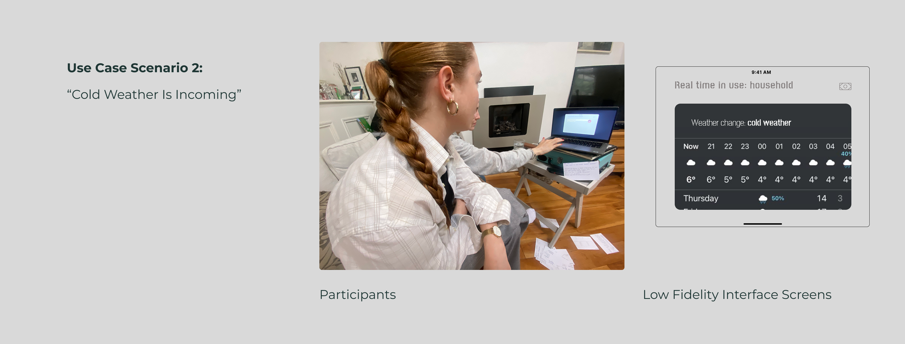
Interaction + UI design of product (app):
Preemptive notification.
"Oh that's useful now I can adjust my heating in advance"
"I wish it gave me a quick tip, like try setting thermostat to X"
Insights:
Users appreciate preemptive results.
They want actionable suggestions, not just a warning.
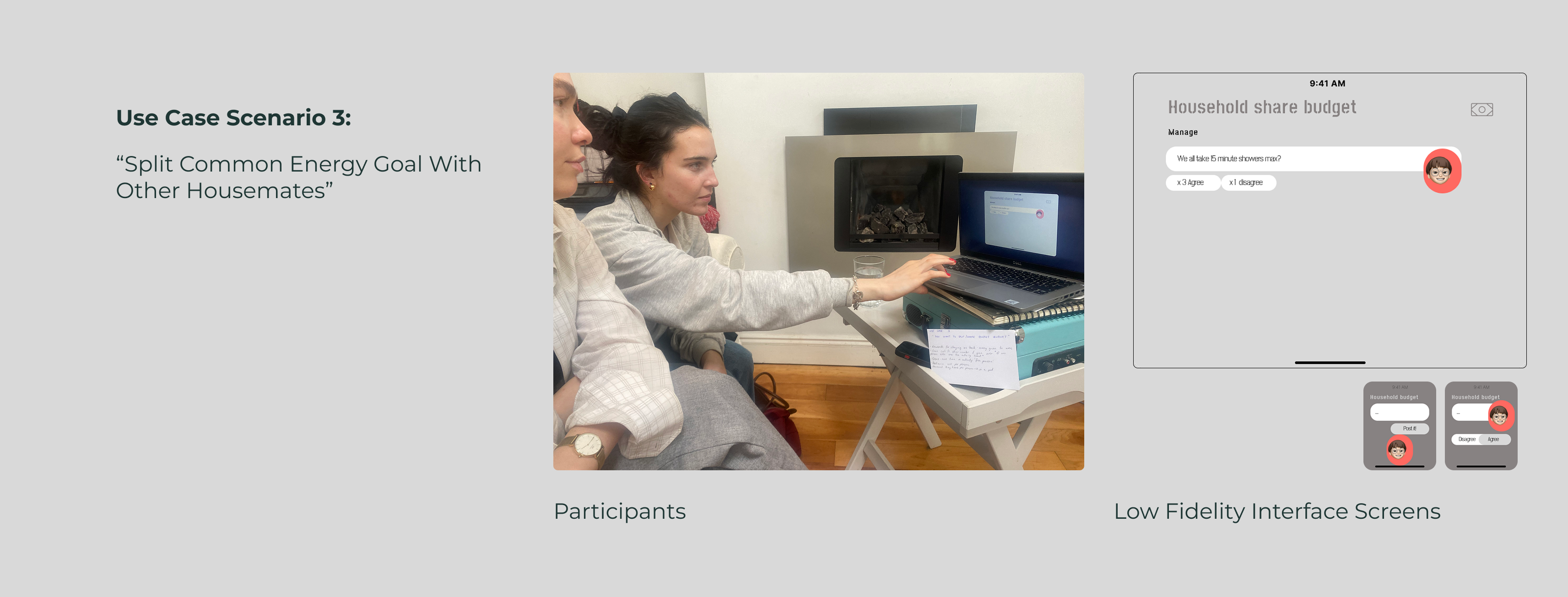
Interaction + UI design of product (app):
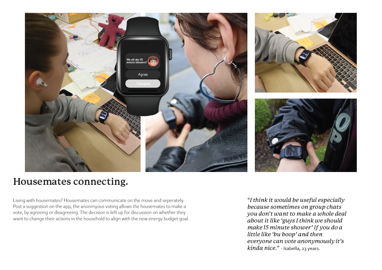
Notification pops up individually on the digital watch of users living in the household + on the sharing screen.
"I like that it encourages teamwork"
"This is cool but I hope it doesn't feel like im guilt tripping my housemates"
Insights:
Users like the collaboration but do not want it to feel intrusive or nagging.
Showing a clear impact would make the request more persuasive.
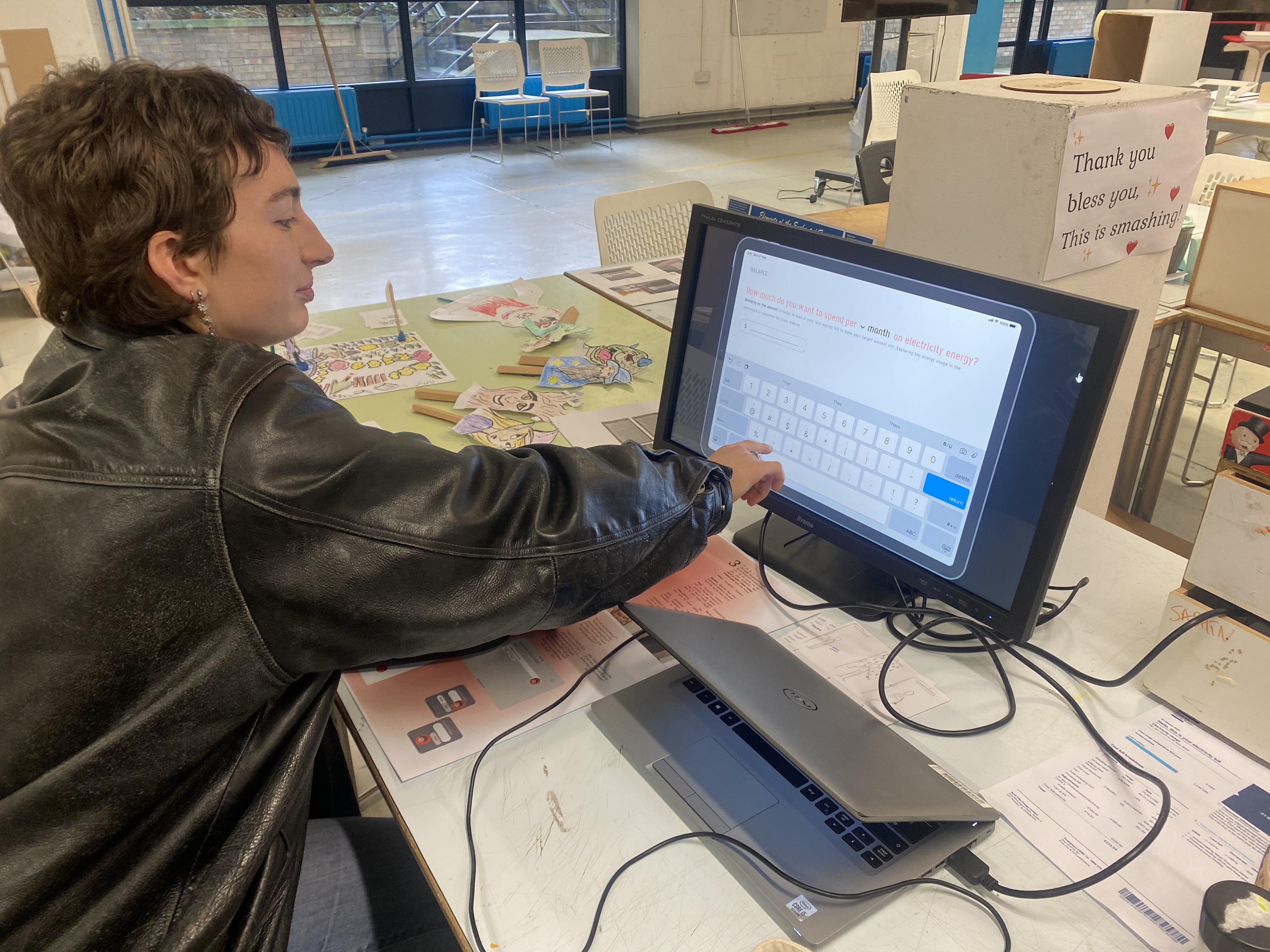
#3 Usability testing
Iteration 1 screens
.png)

.png)